How to make a pie chart in Google Sheets
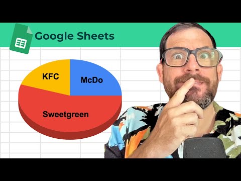
Put categories in one column and numbers in the next. Select both columns, then Insert → Chart. In the Chart editor, set Chart type to Pie chart (or Doughnut). Use the Customize tab for slice colors, legend, and titles. Pie charts work best for parts of a whole with a few categories; use a bar chart when you have many slices or want precise comparisons.
Steps
-
1
Arrange labels in one column and values beside them.
-
2
Select the range including headers.
-
3
Choose Insert → Chart.
-
4
In Chart editor → Setup, pick Pie chart and adjust Customize options.
Related tutorials
These videos might help you go deeper on this topic.
That Viral Growing Plant Progress Chart
Better Sheets on YouTube
Watch matching videos from youtube.com/bettersheets.

Terms and formulas behind this
Want the full definition or how a formula works? Start here.
Related questions
How to make pie chart Google Sheets
Put labels in one column and values next to them, select both, then Insert → Chart. In the Chart editor, set Chart type to Pie chart. Use the Customize tab for colors, legend, and titles. Keep categories few for pie charts; use bar or line when you have many series or trends over time.
Get the answer →How do i make a pie chart in Google Sheets
Put labels in one column and values next to them, select both, then Insert → Chart. In the Chart editor, set Chart type to Pie chart. Use the Customize tab for colors, legend, and titles. Keep categories few for pie charts; use bar or line when you have many series or trends over time.
Get the answer →Can you make a pie chart in Google Sheets
Put labels in one column and values next to them, select both, then Insert → Chart. In the Chart editor, set Chart type to Pie chart. Use the Customize tab for colors, legend, and titles. Keep categories few for pie charts; use bar or line when you have many series or trends over time.
Get the answer →How to make a pie chart in google spreadsheet
Put labels in one column and values next to them, select both, then Insert → Chart. In the Chart editor, set Chart type to Pie chart. Use the Customize tab for colors, legend, and titles. Keep categories few for pie charts; use bar or line when you have many series or trends over time.
Get the answer →How to make a pie chart on Google Sheets
Put labels in one column and values next to them, select both, then Insert → Chart. In the Chart editor, set Chart type to Pie chart. Use the Customize tab for colors, legend, and titles. Keep categories few for pie charts; use bar or line when you have many series or trends over time.
Get the answer →How to combine cells Google Sheets
Select the cells, then Format → Merge cells (or the toolbar Merge icon). Choose Merge all, horizontally, or vertically. Only the top-left value is kept. Avoid merging inside data tables you still sort or filter.
Get the answer →Need more than a quick answer?
Membership unlocks 636+ tutorials, unlimited generators, and every template.